Loading
Brett Mickan from Brett Mickan Design agrees that a client’s existing collection can be an incredibly useful reference. He says the magic is in creating tension between the colours in the artwork and the colour of your wall.
“The worst thing you can do is to match an interior to a piece of art,” says Mickan. “What gives a house energy and vibrancy sometimes is the clashing of colours.”
Area rugs
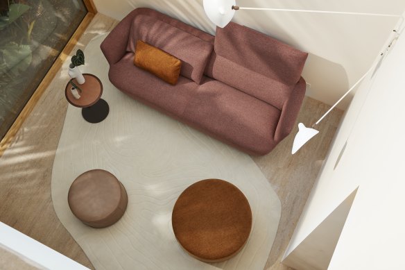
Design mentor at King Living, Chris Cooke says taking your design cues from a floor rug you love is an excellent starting point for building a whole colour palette.
“It’s an anchor point in the room,” he says. “In interior design, you can start with a focal point and move out or an anchor point and move up.”

King Living design mentor, Chris Cooke, says you can use a rug to build a room from the ground up.Credit: King Living
Unlike wall-to-wall carpet, which is usually a uniform colour, a floor rug is an opportunity to express a little – or a lot– of colour and pattern.
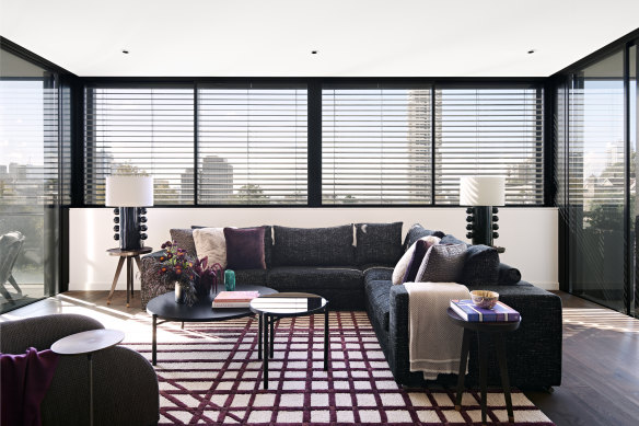
Kaiko says on a recent project in Darlinghurst, he commissioned a bold geometric rug to specifically sit in a living area bathed in light.
“On the exterior of the building, there’s a series of external louvres and when the sun comes in, it casts horizontal shadows,” he says. “We used that [pattern] to design a rug.”

Interior designer Nic Kaiko made this rug the focal point in the room. It’s design was inspired by the shadows created by the louvred windows.Credit: Kaiko Design
Exterior landscape
Given the number of homeowners choosing to opening up the back of the house to create indoor/outdoor flow, it’s not a surprise that many designers look to the natural environment for their colour cues.
Loading
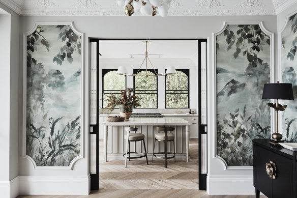
Kate Nixon from Kate Nixon Studio says opting for a palette drawn from the natural environment automatically grounds the colour scheme, creating a sense of calm and cohesion.
“It is important whatever we do, it sits cohesively in the landscape so it feels like it belonged. You need to get that flow from room to room,” she says.

Designer Kate Nixon says connecting spaces to the natural landscape creates a sense of connection and cohesion.Credit: Kate Nixon Studio
Mickan says it’s no accident that greens and blues pop up regularly in his work, as he seeks connections between the interior and exterior environments.
“It needs to belong where it is and that is not based on the architecture but the location,” he says. “A lot of contemporary homes are a lot of glass with a view, which becomes part of the space. I use a lot of greens and blues – it’s about balance.”
Your wardrobe
We’re all naturally drawn to certain colours but it can sometimes be difficult, when you’re put on the spot, to pinpoint what those colours are. Nixon says it can be surprisingly useful to look to a client’s wardrobe for hints.
“The wardrobe is useful if we feel we are getting stuck because it’s a good way to understand what the client naturally gravitates towards.”
Cooke agrees that what we wear is a window into our design preferences, even if we don’t know it.
“People often don’t really realise how they are expressing their personality. It’s a really good place to look for clues.”
Make the most of your health, relationships, fitness and nutrition with our Live Well newsletter. Get it in your inbox every Monday.


